 Carinsider
Car Logos Go Flat, and Some Lose Their Personality
Design·November 6, 2026
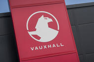
Vauxhall's griffin has been simplified again, and this time it has put down its flag. The brand's new emblem is flatter and more basic, part of a wider shift that has seen McLaren and a long list of other carmakers strip their badges back to clean, two-dimensional shapes. Commentators have pointed out that the griffin has not held its flag for the first time in 111 years.
The flag may be a small detail, but it stands out. In heraldry, the griffin's sex determines its features, and the Vauxhall version is a female with eagle's wings. Whether dropping the flag reflects a change in how brands feel about patriotic or flag-waving imagery is hard to say. It could easily be a coincidence. Still, the change will prompt questions about what the company wants its badge to say.
The larger driver is practical. A modern logo has to work on a phone screen at 120 by 120 pixels, on a billboard, moulded into a plastic trim piece and printed on a baseball cap. Shading, gradients and 3D effects do not survive that range of sizes and materials. Designers have responded by favouring monochrome, flat marks that hold up everywhere. Lotus and Volkswagen made similar moves in 2019, Citroën followed in 2023, and McLaren's recent update fits the same pattern.
The cost is individuality. Without shadows, reflections and rich colour, many badges begin to look alike. Car logos have long been one of the easiest ways to recognize a brand at a glance, and a growing number now resemble app icons. Strip away the details and you are left with shapes that are simple to reproduce but harder to tell apart, much like the endless variations of QR codes.
There is a certain irony here. The screens, software and manufacturing systems that display these logos have grown enormously complex, yet the logos themselves are being pared down to accommodate them. Most things in life become more intricate as they develop, from living cells to cities. Logos are heading in the opposite direction.
It is also hard to blame the designers. The pressure comes from the technology that has to reproduce a mark accurately, not from a creative choice to make everything look the same. Brands will likely keep simplifying, because the practical case is strong. The open question is whether they can keep a distinctive identity once the badge is reduced to its most basic form. The griffin, for one, may well return to its flag one day.
Reporting based on an external source.